Navigation
An assessment and redesign of Brita's navigational icons
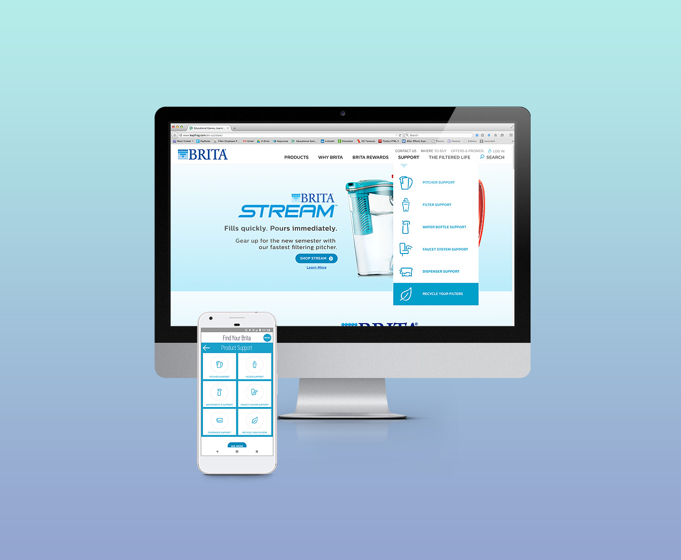
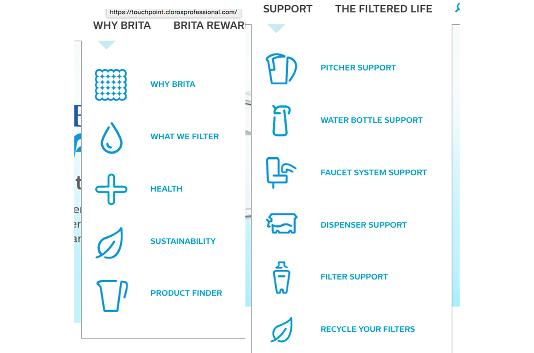
Project Overview
Brita was updating their navigation system. This entailed taking existing iconography, previously designed as stand-alone design elements, and updating them to a cohesive system. Seemed like a pretty straight-forward task but it did prove to be a little tricky given the various sizes and ratios to start with.
Working directly with the developer, art director,
business/product owner and the project manager, we were
able to use a staging site to make updates and review in
context for the duration of the project timeline.
Research


- My first step was to collect all the icons live on the site and assess how they were used.
- After assessing what the typical online Brita customer already understood of these icons, I honed in on which icons would be most appropriate for the navigation update.
Assessment

- I then collected the icons into one document, scaled them at their current proportions for the two dimensions needed and seperated them into the following:
–Which ones were already scaling near the ideal proportions?
–Which ones were the most far off from the ideal proportions?
–And finally, where in the navigation update were icons still needed? Luckily we were only missing one icon. - I proceeded to move forward and made the size ratios consistent throughout the iconography and make the appropriate updates.
Final Thoughts
This was my first attempt at a cohesive icon update from existing ones. Looking back, it might have been easier for me to start from the beginning. But using the existing icons and adjusting the curves, height and width as needed, did the job given the timeline and budget.
-
Email
hello@nepunnee.website -
Location
I'm an American currently abroad in beautiful Hoi An, Vietnam -
Elsewhere
©2025. All rights reserved. Design: HTML5 UP.