Design Systems
A complete overhaul of the design system for CA Technologies
Project Overview
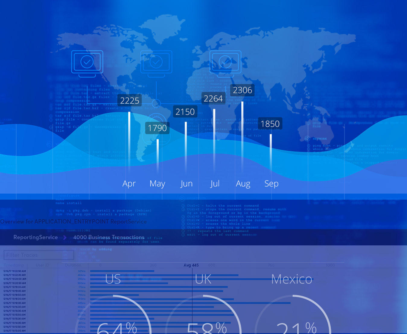
Computer Associates Technologies had a vast array of products and services that could leave one dizzy. Luckily, at the onset of the project, it was decided to start with one user journey, the Application Programming Interface Managment journey.
Partnering with the CA Tech Senior UX designer, it was determined this journey can be broken down into three pages: category, subcategory and product. Each of the three pages could be broken down to include pertinent sections such as the submenu, microservices, case studies, customer reviews, industry expert insights and various online resources.
Other partnerships included the account manager, content strategy, information architect, developers, producer, creative director, associate creative director and three designers under my art direction.
The updated design system was a well-received effort with a spectacular team and many lessons along the way. At almost 200 creative assets to deliver in about a month, this was definitely a very successful collaboration with a larger team.
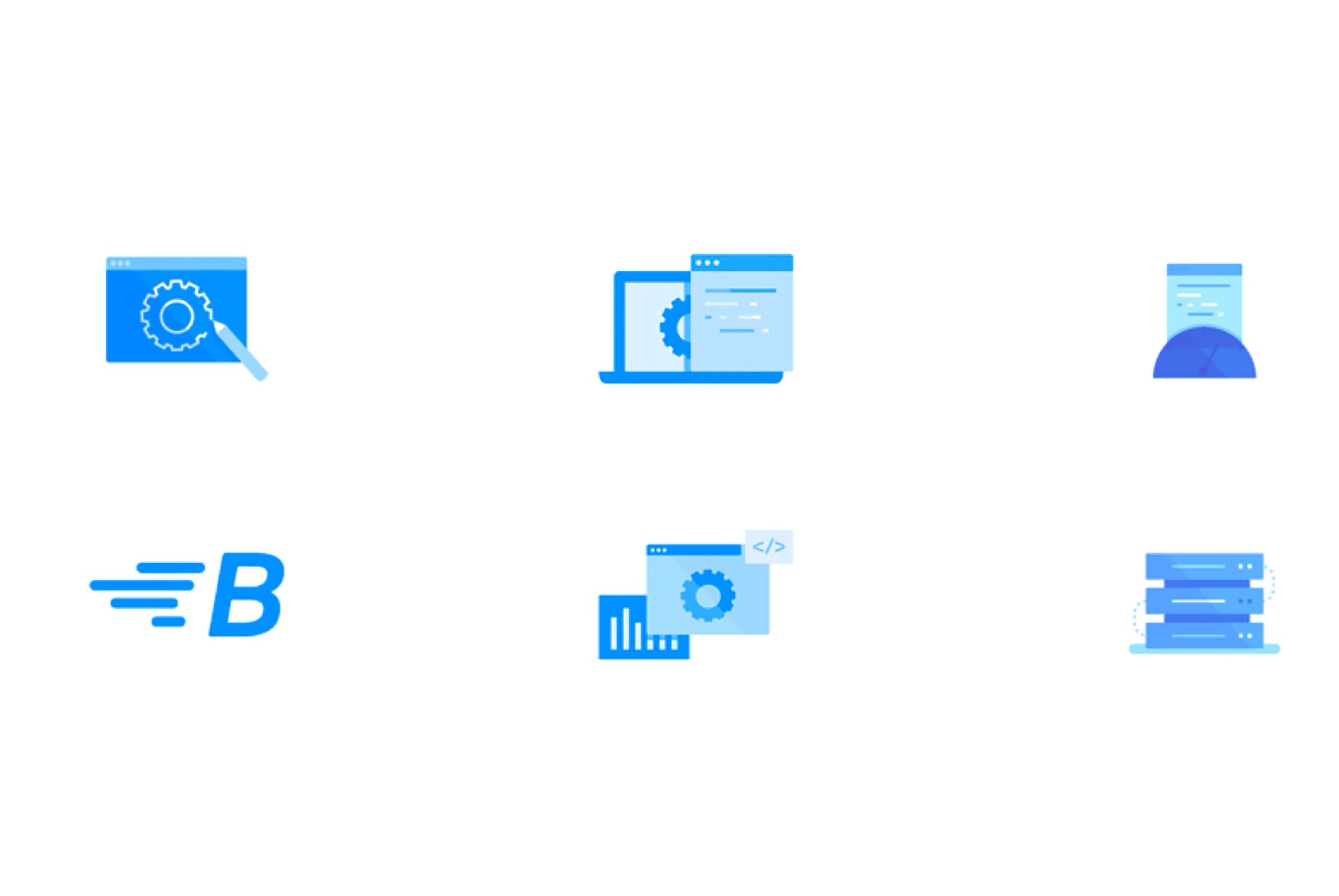
Iconography Use
Leveraging the existing icons colors, scale and layout, were used to differentiate the information they represented; blue for key benefits and grey for resources that could be downloaded. Set up as components in the design system, it made for a very flexible module of varying numbers of benefits/resources.
Style Guide
Developing a color palette took from existing brand colors with a few minor adjustments. The 12-column, 1170px grid with 30px gutters was decided on based on its flexibility to be used with already existing frameworks like Bootstrap. The developers made the announcement Zeplin would be used. From a coding perspective, this saved us all time as Zeplin pulls the style guide from the Sketch files converting it to code. This way I could also focus on the branding and design.
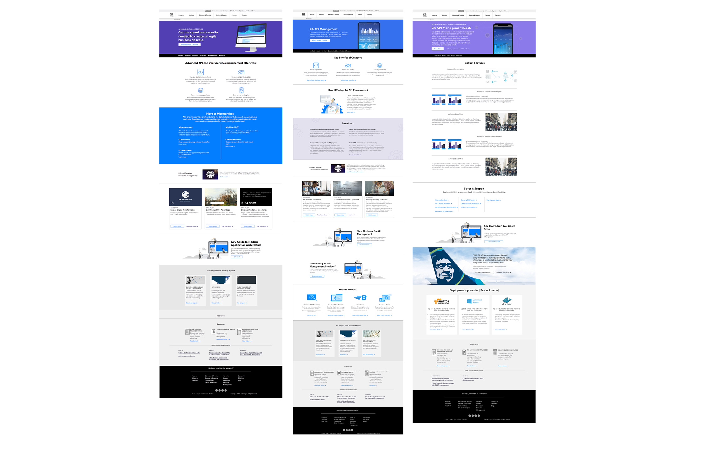
Which experience is best for the user? parallax or no parallax scroll?
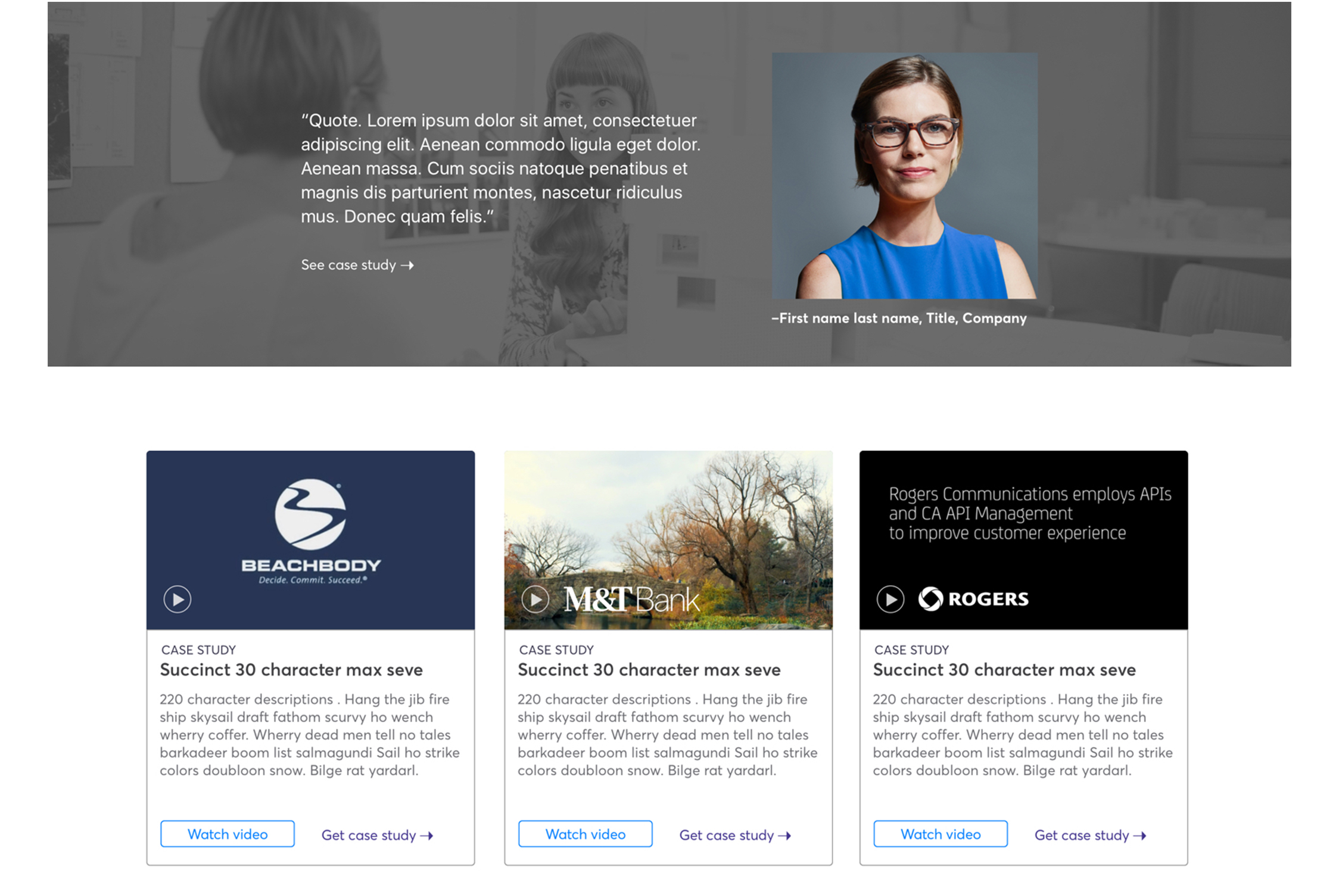
Initially designed for a parallax scroll for what was once called "Thought Leadership", this module became a case study section. CA Tech has a vast amount of case studies for each of their products. The top image shows a mockup for the homepage that would still have parallax scrolling while the bottom mockup was for the category, subcategory and product page.
The thinking behind this decision was for the homepage to be able to draw the user into wanting to know more about one of the most successful product lines for the company. Once the user was two to four clicks into the APIM journey on the website, the static approach would make it an easier way to scroll through information, instead of having to wait for it to parallax scroll through all three case studies and move on to the next section.
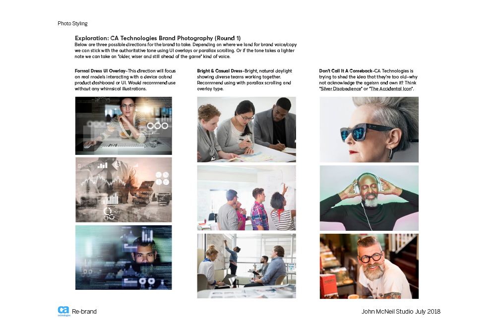
Illustration Research & Art Direction
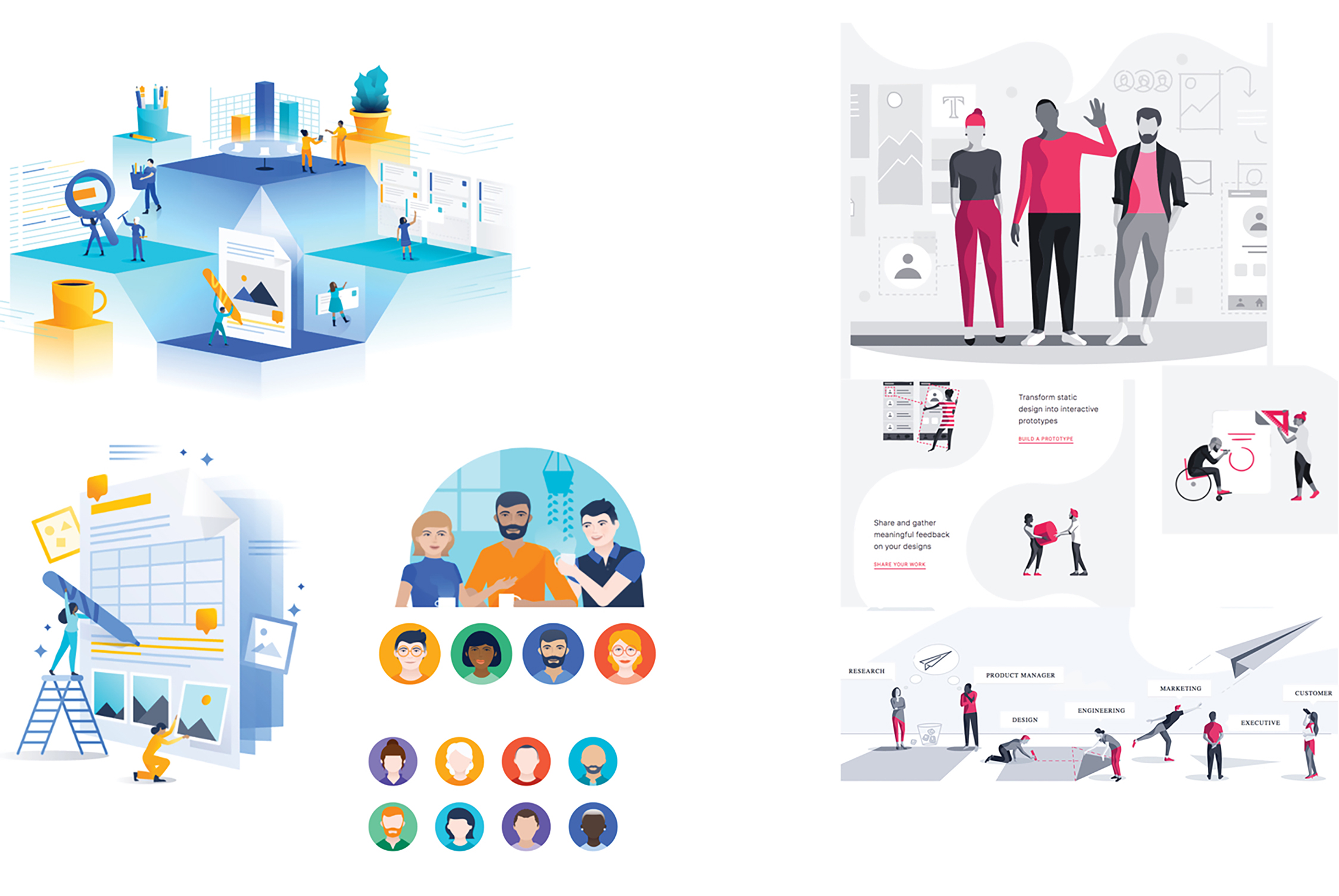
Atlassian and InVision were both prime examples of a highly developed and branded direction to illustration. Both companies reinforced their brand through color while communicating what is at the core of their service or product i.e.; helping teams work together – more efficiently.
The illustrations focus on the kind of teams they help and hint at how. Appropriate text relating to the illustration is flowed in while depicting diversity across skin tone, dress, gender and people of determination (people who need assistance because of limits to their intellectual and/or physical abilities).
I created a template for our first round of illustration design, to give direction in color, weight and proportions.
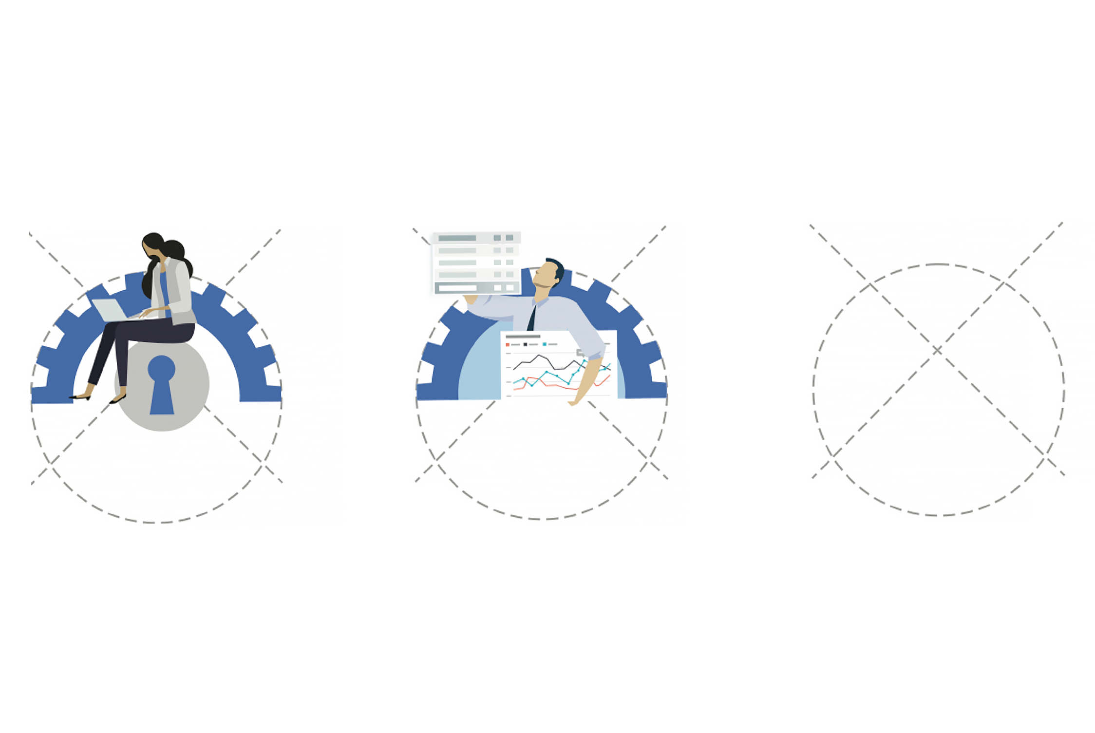
Illustration Development

Initial explorations were done with stock illustrations. Working with the illustrator we decided product and high value asset illustrations need to communicate one set represented related products and the other was a resource (downloadable pdf, whitepaper, etc).
Final Product Illustration
Incorporating feedback from the team, it was decided to move towards a direction that hinted at the product’s functionality and differentiate itself from a download. This also solved the issue of the stock illustrations not resizing very well for use as a smaller illustration.*

On the downloadable assets, considered "high value", they were developed into illustrations representing the company or case study it highlighted. These became more of an environment, rather than a stand alone icon-like illustration.
*Product illustrations do not represent final colors.
Final UX/UI & Thoughts
The final pages went live right before Broadcom acquired CA Technologies. Unfortunately because of this, we were not able to finish the project in full. The intent was to build the user experience from the bottom up. This way, once the homepage refresh was done, all the content would be there for the full user experience. The hompage redesign was not completed and the APIM category, subcategory and product pages went through a Broadcom branding update.
-
Email
hello@nepunnee.website -
Location
I'm an American currently abroad in beautiful Hoi An, Vietnam -
Elsewhere
©2025. All rights reserved. Design: HTML5 UP.